CRL Map: Difference between revisions
mNo edit summary |
Add Download Data gif and instructions |
||
| Line 55: | Line 55: | ||
| style="width:50%; vertical-align:top;" | | | style="width:50%; vertical-align:top;" | | ||
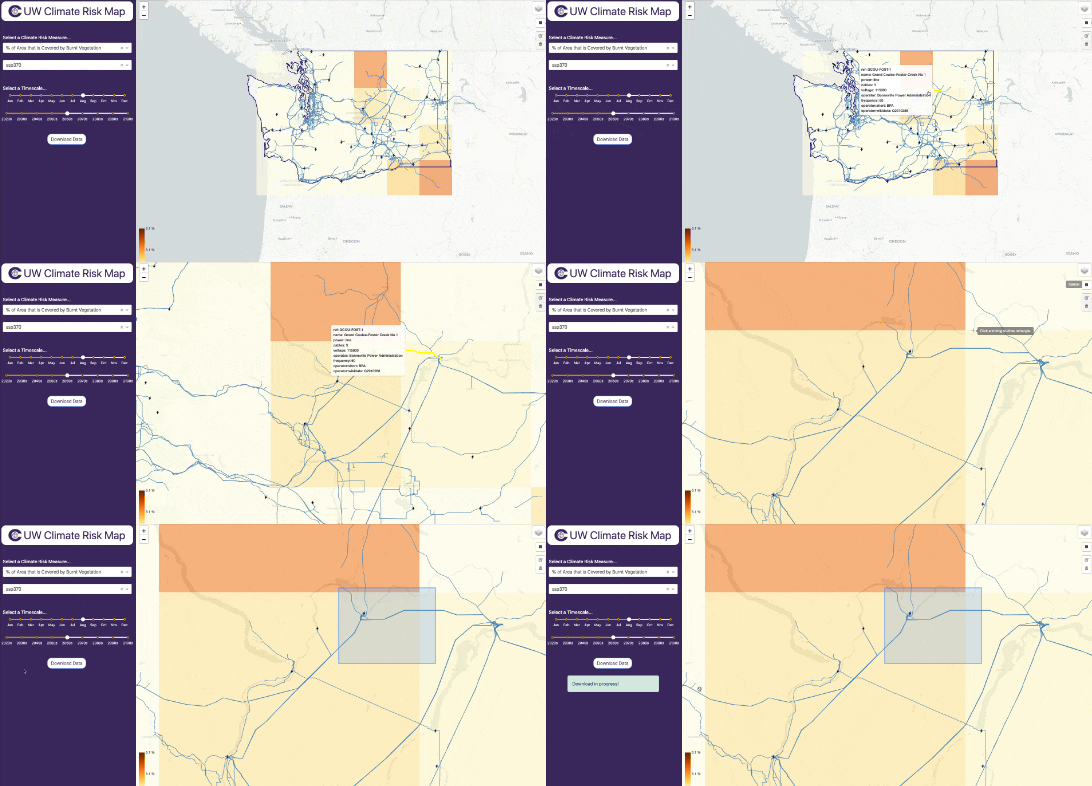
# '''Draw a bounding box''': On the right-hand side below the layers icon, there is a small black box icon. Clicking this will allow you to draw a box (or multiple boxes) over your area of interest. | # '''Draw a bounding box''': On the right-hand side below the layers icon, there is a small black box icon. Clicking this will allow you to draw a box (or multiple boxes) over your area of interest. | ||
# '''Click Download Data''': On the control panel, click the Download Data button to download a CSV file. | |||
| style="width:50%; vertical-align:top; text-align:center;" | | | style="width:50%; vertical-align:top; text-align:center;" | | ||
<div style="display: flex; justify-content: center;"> | <div style="display: flex; justify-content: center;"> | ||
[[File: | [[File:Climate-risk-map-download-2024-10-8.gif|alt=Dropdown Selectors]] | ||
</div> | </div> | ||
|} | |} | ||
Revision as of 17:51, 8 October 2024
Welcome to the Climate Risk Map! This guide will help you get started with using the tool to understand climate-related hazards and their impacts on physical assets. Whether you're new to climate data or an experienced analyst, this guide will walk you through the basics so you can start exploring climate risk insights right away.

Getting Started
Follow this step-by-step guide for a basic overview of the map functionality. The map can be accessed here.
1. Selecting Climate Scenario Parameters
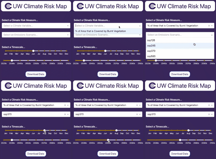
First, we need to select a combination of parameters for the desired climate scenario.
The example on the right illustrates a scenario where the selected measure is "% Area Covered by Burnt Vegetation"—used as a proxy for wildfire risk—under a moderate emissions projection for August in the 2060s.
|
2. Selecting Infrastructure Overlays
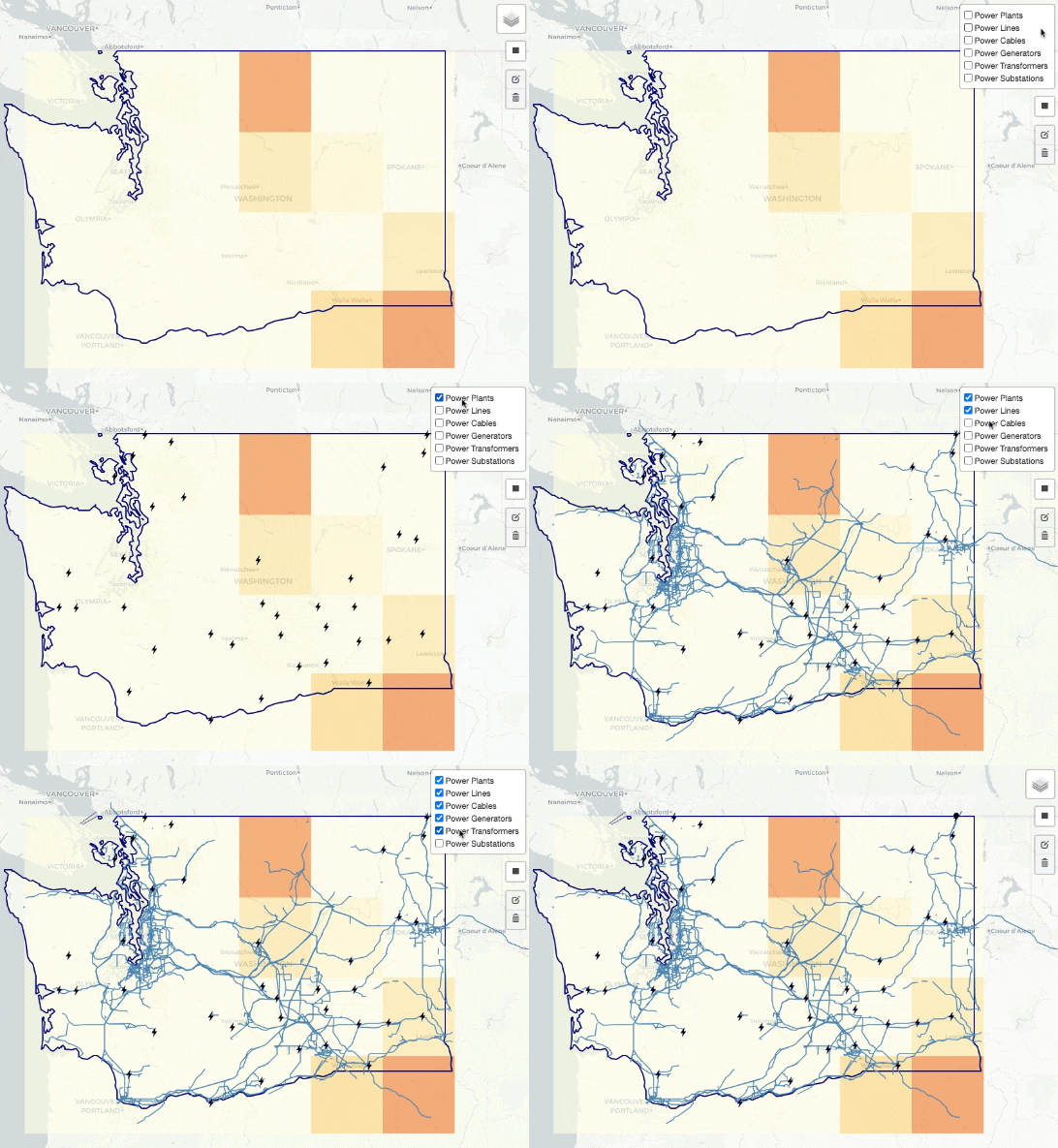
Second, we need to select the specific types of infrastructure we are interested in visualizing.
|
3. Download Data
From here, you can explore the map and your particular areas of interest visually to get a sense of asset exposure. You may wish to download the data to do an offline analysis, which can be done easily.
|


